Blog

Learn How to Create Viral AI Shorts for TikTok, Reels & Youtube Shorts. Discover Trending Formats and Step-by-Step Guides to Boost Engagement and Drive Organic Traffic In 2026 with Short-Form Content.

Cover Image for A dramatic, eye-catching thumbnail-style illustration: a faceless silhouette sitting at a glowing desk in a dark room, multiple smartphone screens floating around them, each showing a viral Shorts video with a view counter skyrocketing past 1 million. A huge upward-trending red graph dominates the background with the number '200 BILLION VIEWS/DAY' glowing in bold neon. Dollar signs and subscriber notification bells rain down. The vibe is exciting, aspirational, and urgent, like a treasure map for creators who want views without showing their face.

Faceless Shorts Strategy 2026: Why Short-Form Dominates Growth, Reach, and Monetization

Most faceless creators are still sleeping on the one format that grows channels 3x faster in 2026. Here's the exact shorts strategy top creators never talk about.

Cover Image for A split-screen YouTube Studio dashboard showing a Shorts-only channel with a modest revenue graph on the left versus a hybrid channel with a dramatically higher earnings curve shooting upward on the right, dollar signs and view count badges floating around the screen, vivid red and green colors, high contrast lighting, the kind of thumbnail that makes you want to click immediately to know which side you should be on.

Can a Channel Monetize Using Only Shorts?

Shorts-only monetization is possible, but most creators are leaving serious money on the table. Here's what the data actually says about RPM, YPP thresholds, and smarter strategies.

Cover Image for A bold, data-driven thumbnail-style image: a horizontal bar chart showing YouTube Shorts length buckets (15s, 30s, 45s, 60s) with corresponding completion rate percentages, the 50–60 second bar glowing neon green and labeled '76% completion rate'. A smartphone in the foreground shows a vertical short-form video playing. Behind it, a blurred red analytics dashboard with rising numbers. Bold text overlay reads: 'THE PERFECT SHORTS LENGTH: REVEALED'. The vibe is authoritative and exciting, like a creator just found a cheat code.

The Best Length for Shorts (Retention Data Breakdown)

Most creators pick their Shorts length randomly. Here's what the retention data actually says, and which length the algorithm rewards most in 2026.

Cover Image for A dramatic split-screen YouTube thumbnail showing two phones side by side: on the left, a creator looking frustrated at a phone with a flat views graph showing 0 views and a red downward arrow; on the right, a faceless AI-generated short going viral with a views counter exploding upward past 1 million in bold green numbers, sparks and confetti flying around it. Bold text overlay in the center reads 'WHY YOUR SHORTS FLOP' in white with a red warning icon. The background is dark with neon accents. The image should feel urgent, relatable and curiosity-provoking for creators who are struggling to get views.

Mistakes People Make When Switching to Shorts

Why your YouTube Shorts aren't getting views, and it's probably not what you think. The real mistakes creators make switching from long-form, exposed.

Cover Image for A dramatic close-up of a YouTube Analytics dashboard glowing on a dark screen, showing a satisfaction score meter spiking into the green zone, surrounded by floating icons of a heart (likes), speech bubble (comments), share arrow, and looping arrows (rewatches). In the background, a blurred faceless video creator silhouette sits at a desk. The overall mood is tense and exciting, like a scoreboard ticking up. Bold red upward arrows pierce through the data. The image should feel like revealing a secret dashboard most creators never see.

Viewer Satisfaction Signals: Likes, Rewatches, Comments, and Shares

YouTube's algorithm tracks way more than views. Here are the hidden satisfaction signals that decide if your faceless videos get pushed or buried in 2026.

Cover Image for A dramatic close-up of a YouTube Studio screen showing a bright blue audience retention graph, with a sharp visible dip highlighted in red at the 30-second mark and a glowing spike mid-video. A creator's hand is pointing at the screen with a look of intense focus. The background is dark with neon data visualizations floating around. Bold text overlay reads 'YOUR GRAPH IS LYING TO YOU' in high-contrast white. The image feels urgent and technical, like a creator cracking the code to viral growth.

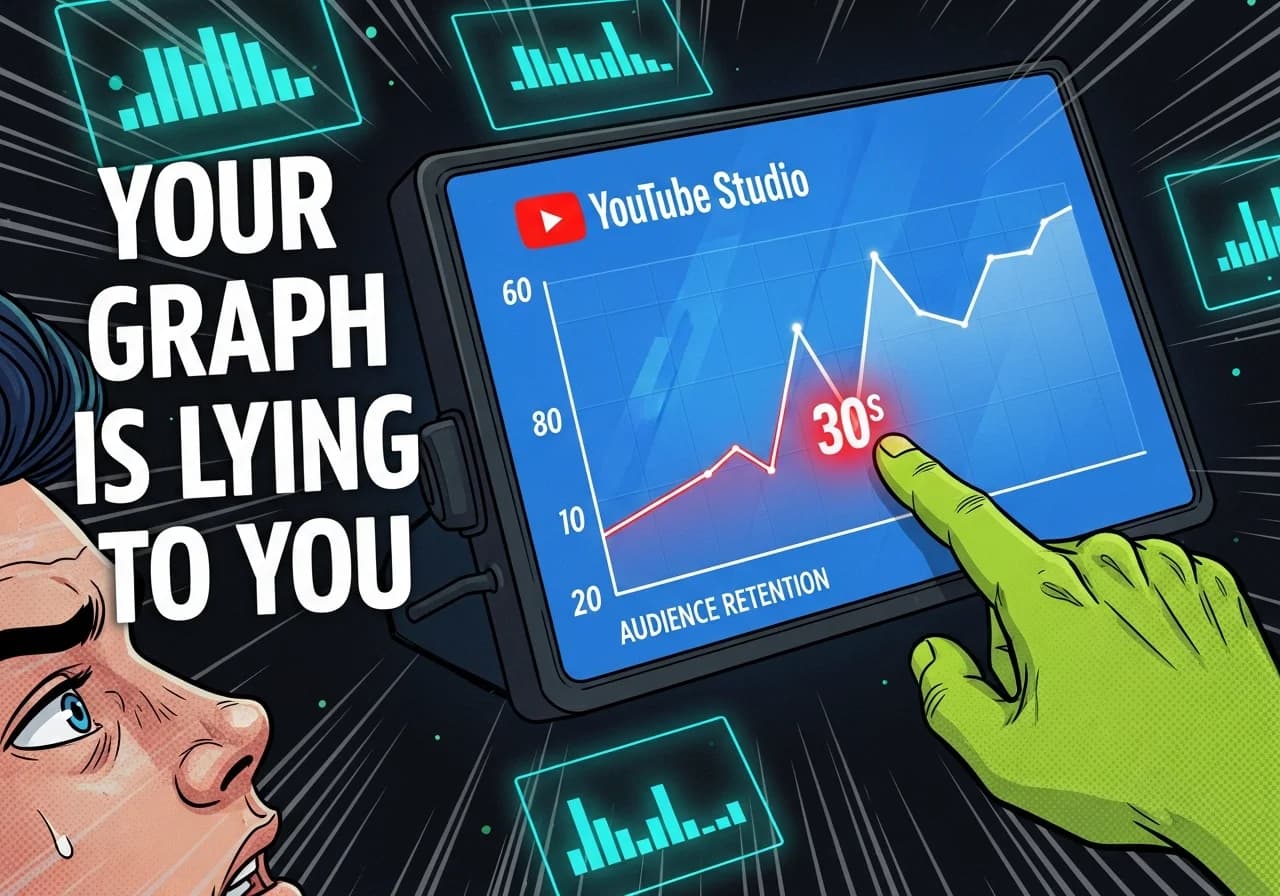
How to Read Retention Graphs Like a Pro

Your retention graph is hiding the exact moments killing your watch time. Here's how to decode every dip, spike, and drop-off inside YouTube Studio before they hurt your channel.

Cover Image for A split-screen YouTube analytics dashboard showing a steep red audience retention drop-off graph plummeting within the first 30 seconds, with a shocked faceless creator avatar on the left side and a glowing red warning sign overlaid. The mood is urgent and alarming — like a creator watching their channel's growth die in real-time. Bold text reading 'KILLING YOUR WATCH TIME' floats over the graph. Dark background, high contrast neon accents, YouTube-style thumbnail design.

The Mistakes That Kill Watch Time in Faceless Channels

Slow intros, static visuals, long pauses — here's what's secretly tanking your watch time on faceless YouTube channels, and exactly how to fix it.

Cover Image for A smartphone held up against a dark background showing a YouTube Shorts feed with a glowing infinity loop symbol overlaid on the video, a retention graph in the bottom corner spiking above 100%, with dramatic red and neon lighting. The vibe is cinematic and exciting, suggesting a creator's secret weapon being revealed — something most people scroll past without realizing.

Looping Structure: The Hidden Retention Trick in Viral Shorts

Viral Shorts loop seamlessly — and it's not an accident. Here's the hidden structure top creators use to boost replays, completion rate, and algorithmic distribution.

Cover Image for A dark, dramatic YouTube analytics dashboard showing a session watch time graph shooting upward in bright red, with a chain of glowing video thumbnails connected by arrows representing a binge playlist, overlaid with the text 'ONE VIDEO = 10 VIEWS' in bold white. The background shows a faceless silhouette at a computer surrounded by notification bells and view counters multiplying rapidly. The scene feels electric and data-driven, designed to make creators feel they're one strategy shift away from exponential growth.

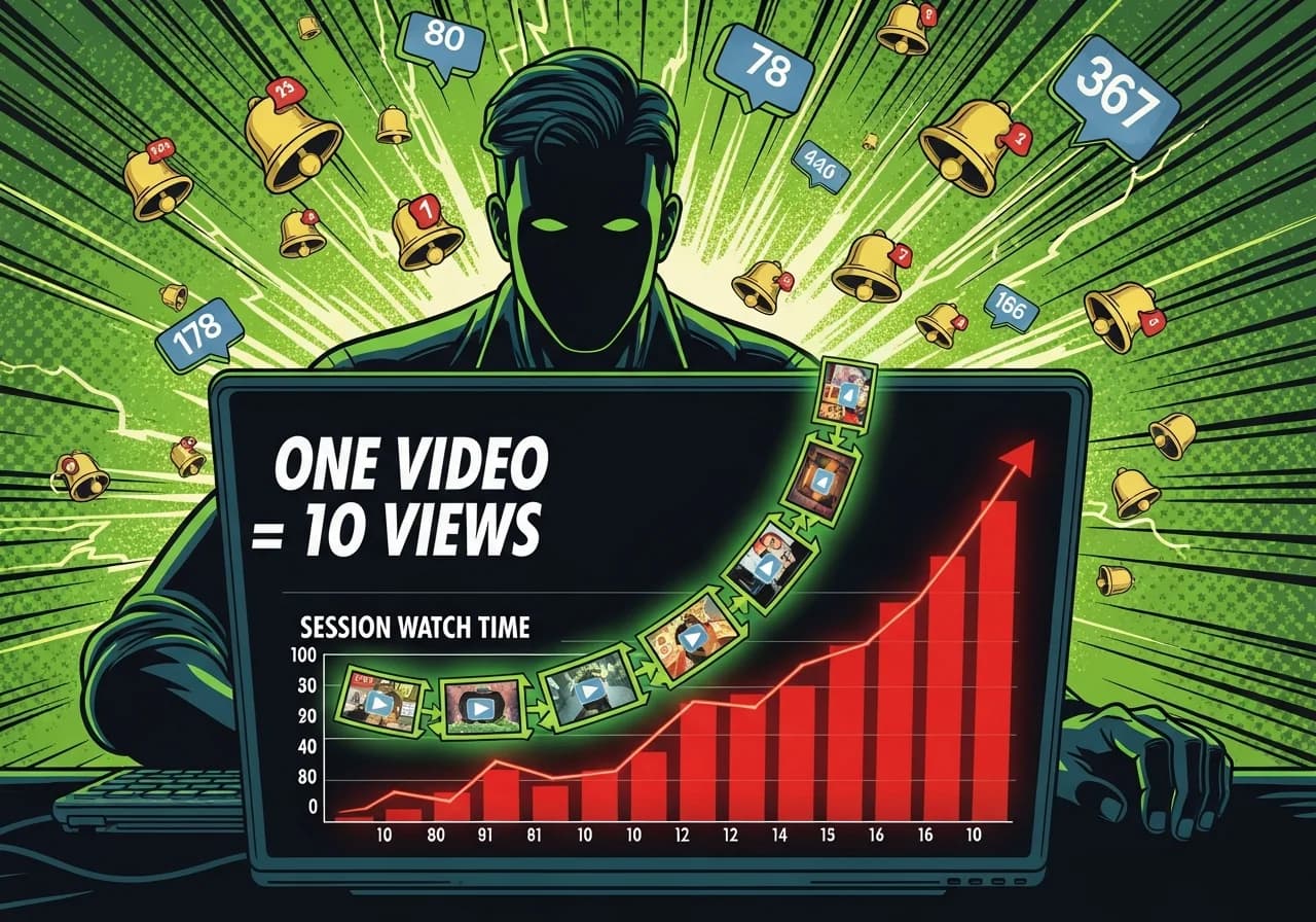
Bingeability: How One Video Leads to 10 More Views

Most creators focus on one video. The algorithm rewards sessions. Here's the binge structure that faceless channels use to trigger the YouTube recommendation engine.