

How to Read Retention Graphs Like a Pro
Your YouTube retention graph is a second-by-second record of every moment viewers decided your video was worth their time, or decided it wasn't.
Table of Contents
- What Is a Retention Graph, Actually?
- The Four Graph Shapes and What They Mean
- How to Read Dips, Spikes, and Drop-offs
- The Key Metrics Inside YouTube Studio
- Benchmarks: Are Your Numbers Any Good?
- How to Turn Graph Insights Into Better Videos
- Final Thoughts
What Is a Retention Graph, Actually?
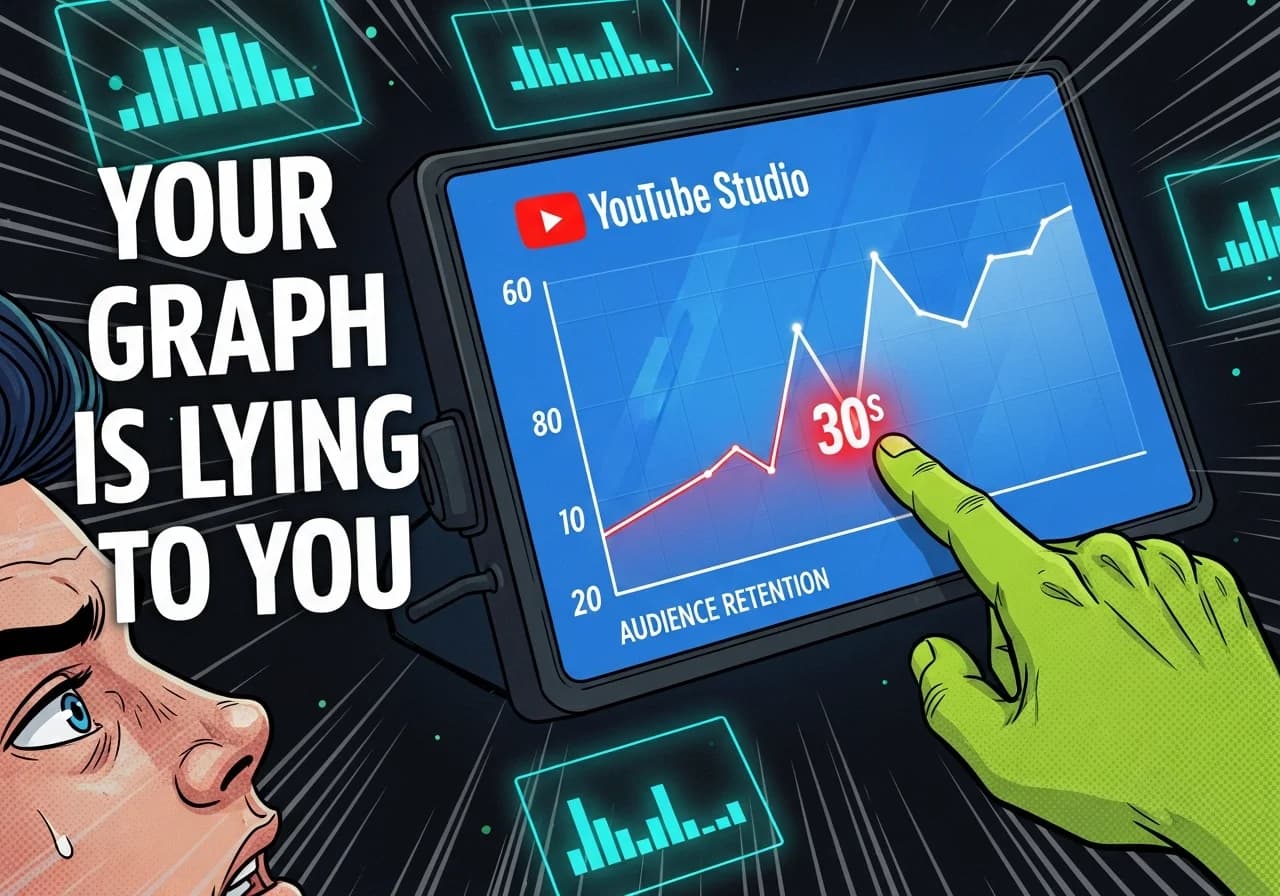
The retention graph inside YouTube Studio shows the percentage of viewers still watching your video at every single second. The horizontal axis is your video's timeline. The vertical axis is the percentage of viewers remaining. The blue line is your video. The gray band is your channel average.
According to YouTube's own documentation, the graph also highlights four labeled moments: the Intro (first 30 seconds), Top Moments (points where almost no one dropped off), Dips, and Spikes. Together these tell you exactly where you won and where you lost your audience.
It sounds simple. Most creators glance at it once and move on. That's the mistake.
The Four Graph Shapes and What They Mean
The overall shape of your retention curve is the first thing to read before zooming into individual timestamps.
| Graph Shape | What It Signals | What To Do |
|---|---|---|
| Gentle, steady decline | Strong overall engagement | Fine-tune individual dip points |
| Steep early drop (first 30s) | Hook is failing | Rework intro delivery and thumbnail promise alignment |
| Cliff followed by flat line | Strong middle, weak opening | Lead with your best content earlier |
| Irregular sawtooth | High engagement, viewers rewinding | Identify spike topics and build more around them |
| Consistent steep slope throughout | Content-audience mismatch | Reconsider format, pacing, or topic targeting |
The flat line in the middle of a video is actually your friend. It means people stopped deciding to leave. Your goal is to push that flat section as far left (toward the start) as possible.
How to Read Dips, Spikes, and Drop-offs
This is where most of the actionable insight lives.
Reading Drop-offs
A drop-off is any noticeable downward step in the curve. Not every small dip is a crisis: some natural exit happens throughout any video. What you're hunting for are steep drops of 4% or more of remaining viewers within a short window.
As creator analytics platform Retention Rabbit explains, common causes of steep drops include:
- Extended explanations without any visual change
- Abrupt topic transitions that break the viewer's mental thread
- Sponsor segments (always expect a dip here)
- Long, slow introductions before delivering actual value
- Audio quality problems or sudden changes in energy
When you find a steep drop, scrub your video to that exact timestamp and watch it fresh. Don't trust your memory of what you recorded. What does the viewer actually experience at that moment?
Reading Spikes
Spikes are moments where the retention line jumps upward or flattens sharply. They usually mean viewers rewound that section to rewatch it. That's exceptional signal.
As MrBeast has noted publicly, "The cool thing about YouTube is they give us super detailed graphs for every video that show the exact second we lose a viewer." The inverse is equally useful: the graph also shows the exact second you captured them.
When you find a spike, ask yourself: what happened there? Did you reveal a surprising fact? Did you deliver a punchline? Did a striking visual appear? Write it down. Repeat it.
The First 30 Seconds Are Everything
YouTube labels the first 30-second window as the "Intro" in the Key Moments report. This single window is the most consequential part of the graph for faceless channels.
A May 2025 benchmark report from Retention Rabbit found that videos where more than 65% of viewers make it past the first minute show 58% higher average view duration across the rest of the video. That compounding effect is why investing in your hook pays back across every second that follows.
For more on building hooks that hold, the full breakdown is covered in the pillar guide on the YouTube Algorithm for Faceless Channels.
The Key Metrics Inside YouTube Studio
Here's what you'll actually see when you open the Audience Retention report, and what each element means in practice.
The Blue Line vs. The Gray Band
The blue line is your video's retention curve. The gray band is your channel's typical retention range for videos of a similar length.
If your blue line sits above the gray band, this video is performing better than your channel average. If it dips below, this video is underperforming against your own baseline.
This comparison matters more than benchmarking against the YouTube average, because your channel has its own audience with specific expectations. A big drop below your gray band in the middle of the video is a stronger warning signal than a number that looks low in isolation.
New Viewers vs. Returning Viewers
Inside the Audience Retention report, YouTube lets you segment the graph by new viewers and returning viewers.
This split reveals something critical for growing faceless channels: if returning viewers watch all the way through but new viewers drop off sharply in the first 30 seconds, your intro is not doing its job for cold audiences. That's a growth ceiling. Fix the intro and you unlock distribution to people who don't already know you.
Sociality.io's 2025 YouTube analytics guide sums it up cleanly: CTR, watch time, and retention together form your "performance triangle." Retention tells you what's happening after the click.
The Absolute Retention Report
Below the standard percentage graph, YouTube also shows absolute viewer counts at each moment. This report is useful when comparing videos of very different sizes. It also shows you the actual number of viewers who started vs. stopped at any given moment, which can surface patterns invisible in percentage-only views.
Benchmarks: Are Your Numbers Any Good?
Here are the 2025 numbers worth knowing, because context is everything when reading your own graph.
- Overall average YouTube audience retention across all videos in 2025: 23.7% (Retention Rabbit, May 2025)
- Viewers lost within the first 60 seconds: 55%+ on average
- Videos that surpass 50% average retention: only 16.8% of all videos
- Average view duration benchmark for short videos (under 5 minutes): aim for 50-70% retention (Uppbeat, 2025)
- For longer videos (10+ minutes): 40-60% is a strong result
What this means for you: if your faceless channel consistently holds 40%+ average retention, you are already outperforming the vast majority of creators uploading to the platform. The gap between 23% and 40% is where algorithm distribution lives.
Also worth knowing from the same 2025 study: channels that improve channel-wide average retention by just 10 percentage points see a correlated 25%+ increase in impressions from YouTube's recommendation system. Retention is not just a quality signal. It is a distribution lever.
For context on how this connects to what actually triggers the algorithm to push your videos, see the related deep dive on why YouTube stops pushing faceless videos.
How to Turn Graph Insights Into Better Videos
Reading the graph is only half the job. Here's how to close the loop from data to production.
Step 1: Audit Your Last 10 Videos
Open YouTube Studio and pull the retention data for your 10 most recent uploads. Sort them by average percentage viewed. Find your top 3 and your bottom 3.
As recommended in the official YouTube Help documentation, look for "typical retention" comparisons to identify whether problems are video-specific or a recurring pattern across your channel.
Step 2: Build a Drop-Off Log
For each video in your bottom 3, note every timestamp where a steep dip occurs and write one sentence about what was happening at that moment. This log becomes your editing checklist for future videos.
Common patterns you'll likely find:
- Introductions that run past 15 seconds before delivering value
- Transitions that feel abrupt or confusing
- Any moment where the visual stays static for more than 8-10 seconds
- Sections where you repeat information you already covered
Step 3: Build a Spike Library
Do the same for your top 3 performers, but this time catalog every spike. These are your creative signatures: the things you do that your audience specifically values enough to rewind for.
Build more videos around those moments. If every spike in your top videos happens when you reveal a counterintuitive fact, you've found a content pattern worth scaling.
Step 4: Apply One Fix Per Video
Don't try to overhaul everything at once. Pick the single biggest drop-off point from your analysis and focus the next video's structure on preventing it. Test it. Then read that video's graph the same way and iterate.
This is the same systematic approach used by faceless creators producing consistent, high-retention content, and it's the difference between guessing and actually improving. Tools like Virvid help take this further by building trending formats and structurally optimized scripts directly into the video generation process, so you're starting from a stronger baseline before you even publish.
If you want to go deeper on the specific structures that hold attention in short-form faceless content, the guide on viewer satisfaction signals and how YouTube weights them covers exactly that.
Step 5: Use the Free Tools Available to You
Before you even publish a video, structuring your script with retention in mind makes a massive difference. A free AI video script generator can help you draft content that front-loads value and builds in natural re-engagement moments before you hit record.
Final Thoughts
Your retention graph is the most honest feedback you'll ever get from your audience. They vote with their attention, second by second, and YouTube records every single vote.
The creators who grow fastest are not the ones with the best cameras or the most subscribers. They're the ones who check the graph after every video, spot the pattern, and change one thing before the next upload.
Start with your last 10 videos. Find the drop-off that keeps repeating. Fix it once. Then do it again.